- contact@brainfuel.io
- Mon - Sat: 8.00 am - 7.00 pm


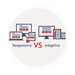
Responsive Web Design

Flexible Layout
Media Queries
Flexible Media
Flexible Layout

Flexible Layout
We no longer depend on pixels and inches. In RWD everything works on percentage or em units. Flexible layout means designing the website layout with flexible grids, which are built using percentage or em units that are capable of dynamically resizing to any width. Our responsive web design company makes sure that your web site runs smoothly in every possible platform. Flexible layout of the responsive website doesn’t recommend the usage of fixed values because the view-port height and width changes from device to device.
Media Queries
Media Queries
Sometimes the width of the browser viewport becomes very small that even scaling the layout proportionally will create columns which are too small to effectively display the content. In this situation media queries can help us to build better experiences. Media queries are the latest technology in CSS3, which makes it possible to apply a CSS only to a specific screen size. Say if you wish to have a different background for your website’s tablet users, you can do so with the help of media queries.
Flexible Media
Flexible Media
A layout is not flexible if some of the elements are fixed. A flexible layout allows the columns and grids to be fluid. But what about the media, images and videos? To achieve responsive images we replace the fixed measurements such as pixels and inches with percentage. The images are made relative to its parent container using ‘max-width’ property so that it adjusts according to the container’s percentage width. This is applicable only for inline images and the CSS3 has introduced a new property called background-size for background images.